Introduction:
In a world that never stops buzzing, where screens are filled with endless content and distractions are just a click away, 2024 is emerging as the year of digital detox. As consumers become increasingly overwhelmed by the digital clutter, the demand for simplicity and calm online experiences is growing. This shift is paving the way for a powerful trend in web design—minimalism. More than just a visual style, minimalist web design is about creating spaces where users can breathe, focus, and engage with content that truly matters. For businesses, embracing minimalism isn’t just a design choice; it’s a strategy to connect more meaningfully with audiences in an era where less is more.

1. The Rise of Digital Overload
The past decade has seen an explosion of content across the web. From social media feeds overflowing with posts to websites jam-packed with ads and pop-ups, the digital landscape has become overwhelming. Users are bombarded with information, leading to decision fatigue and a yearning for simplicity. This cultural shift is influencing how people interact with technology, and it’s reshaping their expectations of what a website should offer.
2. What is Minimalist Web Design?
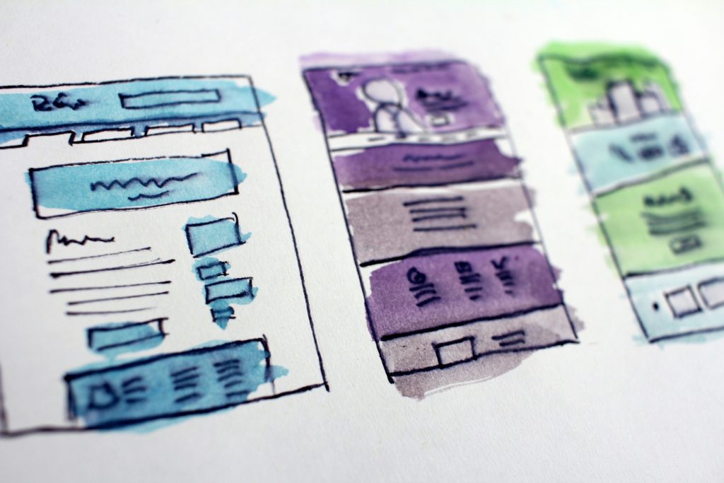
Minimalist web design is all about stripping away the unnecessary and focusing on the essential. It’s characterized by clean lines, ample white space, simple color schemes, and a focus on usability. The goal is to create a seamless experience where users can easily find what they’re looking for without being distracted by extraneous elements. In a minimalist design, every element serves a purpose, whether it’s guiding the user’s attention or making navigation intuitive.
3. The Benefits of Minimalism for Businesses
• Enhanced User Experience: A minimalist website is easy to navigate, which reduces bounce rates and increases the time users spend on your site. By eliminating distractions, you help users focus on the content or actions that matter most, whether that’s reading a blog post, signing up for a newsletter, or making a purchase.
• Faster Load Times: With fewer elements to load, minimalist websites tend to be faster, improving overall performance. This is especially important as users expect instant gratification and as page speed becomes a more significant factor in search engine rankings.
• Better Mobile Experience: Minimalism naturally lends itself to responsive design. With fewer elements to rearrange, minimalist websites often translate better to mobile devices, providing a smoother experience for users on the go.
• Clear Brand Messaging: By focusing on the essentials, minimalist design helps your brand message shine through. There’s no clutter to distract from what you’re trying to communicate, making your site more effective at converting visitors into customers.
4. How to Embrace Minimalism in Your Web Design
• Prioritize Content: Identify the most critical content and features on your site and eliminate anything that doesn’t serve a clear purpose. This might mean cutting down on text, using simpler navigation menus, or reducing the number of images and videos.
• Use White Space Effectively: White space isn’t just empty space; it’s a powerful design tool that can guide users’ attention and make your site feel more open and inviting. Don’t be afraid to embrace it.
• Simplify Navigation: Minimalist websites often feature streamlined navigation with fewer options. Consider how you can simplify your menu to make it easier for users to find what they need quickly.
• Focus on Typography: In a minimalist design, typography takes center stage. Choose fonts that are easy to read and align with your brand’s aesthetic. Use font size, weight, and color to create hierarchy and guide users through your content.
5. Real-World Examples of Minimalist Web Design Success
Several brands have successfully embraced minimalist design to stand out in a crowded digital space. Look at Apple, whose website is a masterclass in minimalism, or Google, which is synonymous with simplicity. These brands demonstrate that less can indeed be more, creating user experiences that are not only beautiful but also functional and memorable.
Check out Color Psychology in Web Design: Transform Your Brand’s Image
Conclusion
As we move further into 2024, the trend toward minimalist web design is set to grow. For businesses, this presents an opportunity to create websites that are not only visually appealing but also user-friendly and efficient. In an age where digital detox is becoming a priority, a minimalist approach to web design can help you cut through the noise and connect with your audience in a more meaningful way. If your website feels cluttered or overwhelming, it might be time to consider a minimalist redesign—because in today’s fast-paced world, simplicity truly is the ultimate sophistication.